Responsive Figma to Webflow: Desktop, Tablet, and Mobile
By UpBuilder Team
Reviewed and updated July 12, 2026
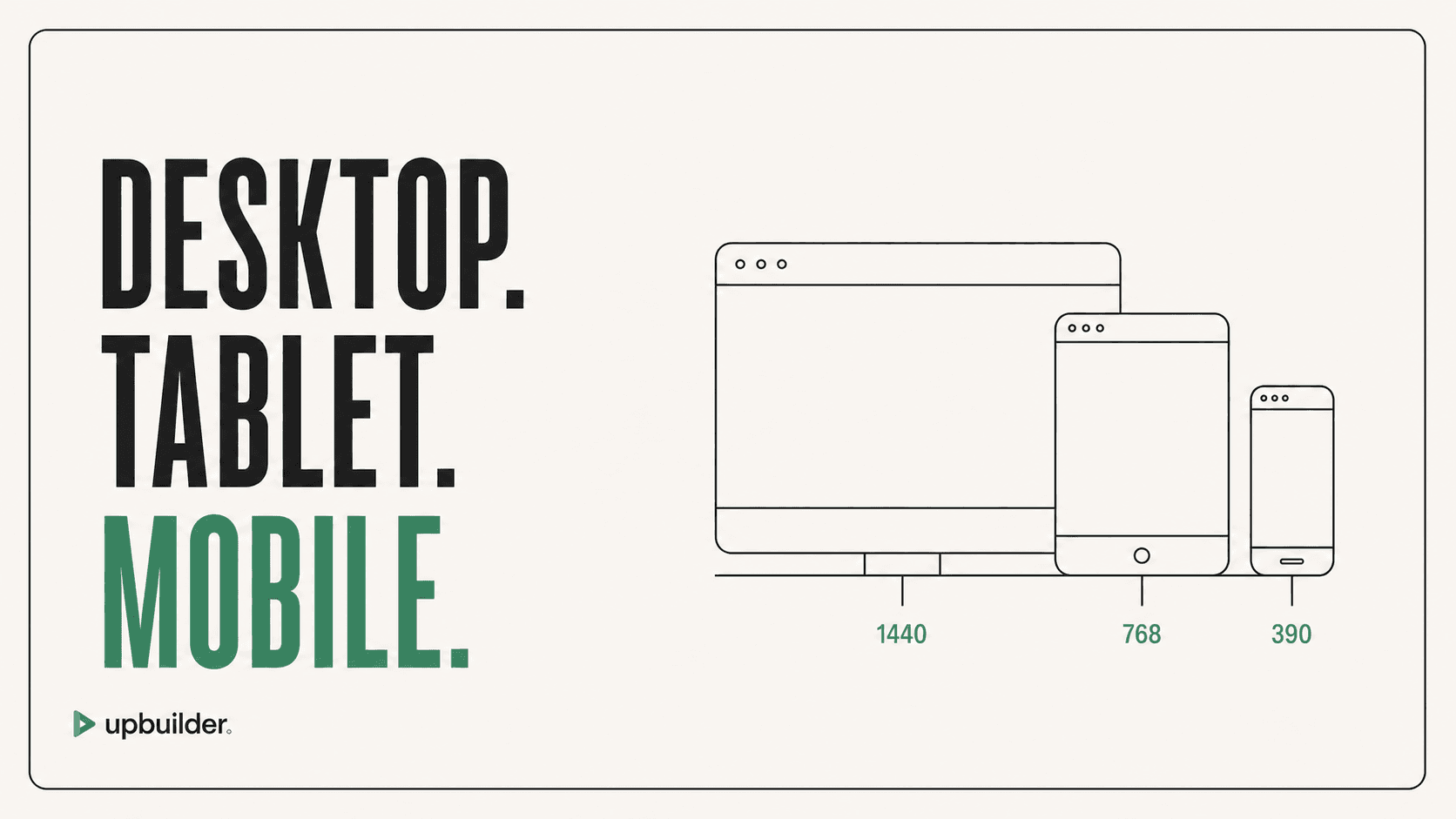
Short answer: A responsive conversion should infer behavior between reference widths, not create three unrelated fixed screenshots. Group variants into one page, define fluid rules, and test intermediate widths where layout failures usually appear.
What matters most
- Provide desktop and mobile references when possible.
- Group responsive variants into the same logical page.
- Use fluid sizing and intentional breakpoints.
- Test intermediate widths, not only named devices.
One design must work across every width
Responsive design is a behavior problem
Figma shows selected states of a design. The browser must render every width between them. A converter needs to decide when rows wrap, grids collapse, navigation changes, images crop, text reflows, and decorative elements move or disappear.
UpBuilder organizes selected variants and reviews desktop, tablet, mobile, and additional widths. That gives the model more evidence and gives QA a better chance to catch overflow, overlap, and unexpected stacking.
Common responsive failures
Fixed widths, absolute positions, missing min-width rules, long headings, incorrect source order, and image aspect ratios cause many conversion problems. Test content extremes, not only the exact sample copy.
- Horizontal overflow on small screens
- Cards that become too narrow before stacking
- Navigation that has no mobile behavior
- Text and buttons that overlap
- Images that crop the important subject
- Desktop visual order that becomes incorrect for keyboard and screen-reader users
A better acceptance standard
Approve the site at the exact Figma widths and several intermediate widths. Include portrait and landscape mobile, keyboard navigation, content zoom, and real browser font loading. Record any intentional differences from the static design.
Responsive source order and accessibility
A desktop composition may place content visually in an order that becomes confusing when cards stack. Preserve a logical document order for keyboard and screen-reader users, then use layout properties to create the desktop composition without duplicating meaningful content.
Test at 200 percent zoom, with long headings, keyboard focus, reduced motion, and browser text resizing. Responsive quality includes usable content and controls, not only matching screenshots.


Common questions
Does Figma to Webflow automatically become responsive?
Not reliably from a single desktop frame. Provide responsive references or clear behavior rules, then test intermediate widths.
How many breakpoints should I test?
Test the destination breakpoints plus widths immediately before and after major layout changes. Include narrow mobile and wide desktop extremes.
Can UpBuilder group desktop and mobile frames?
Yes. UpBuilder is designed to organize selected responsive variants into the correct pages before building.
Verify current access before building
Capabilities, destinations, and usage limits can change. Confirm the current options shown inside UpBuilder before committing a production project.
Ready to build from Figma?
Build your selected Figma designs into an editable website and review the real output.
Start a build